

If you’re interested in writing about Opteo, or need to use our logo on your website, you’ve come to the right place. Below, we’ve created some simple guidelines to help you with using our assets, including logos, icons, and imagery.
This section covers a few parameters for using our assets, such as required spacing, approved colours, and some simple mistakes to avoid.
Remember to leave enough whitespace around the logo so things don’t get too crowded. At a minimum, the logo should always surrounded by at least one iconWidth of whitespace.
The Opteo logo works best in colour on a solid white background. This is the recommended usage of the Opteo logo in print and on the web. For darker backgrounds, ensure adequate contrast.

The colours used in the Opteo logo are Opteo Blue (#006dff), Opteo Dark Blue (#0035ec), Opteo Light Blue (#3fbbff), Opteo Lighter Blue (#73d8ff), and Opteo Black (#010105).
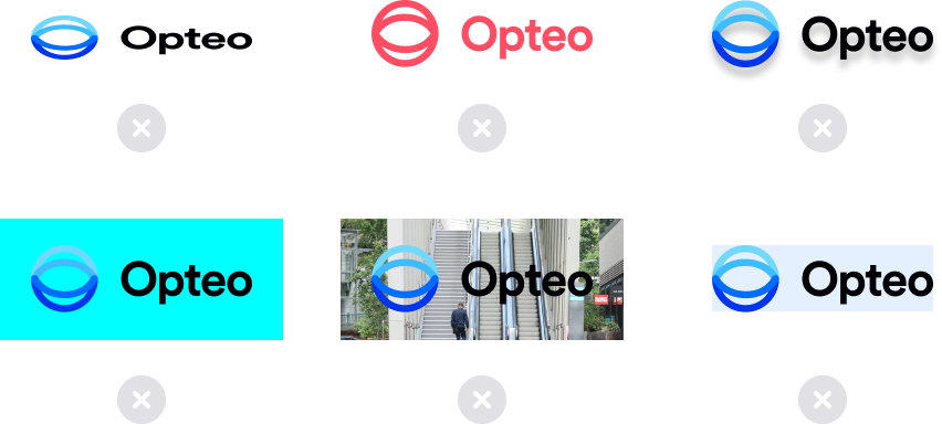
Please don’t stretch or distort the logo, add drop shadows, use with an unapproved colour, on top of a complicated background image, or in a container with too little room for spacing.