How does Opteo affect Google Ads performance?
When we talk to potential customers, they often want to know how Opteo will affect their Google Ads results. In this post, we compare accounts that use Opteo against a control group, and break down the changes you can expect to see in your first 90 days with Opteo.
Designing the experiment
What did we do?
To understand the impact of using Opteo on a Google Ads account, we split a selection of accounts into users and non-users — in the former, accounts that signed up and used Opteo, and in the latter, accounts that signed up but didn't use Opteo. We studied a number of metrics in more detail, including Quality Score, Click Through Rate, Conversions, and Spend. We gathered the data for 90 days before and after an account signed up to Opteo.
Selecting the accounts
Accounts had to hit the following criteria to be eligible for inclusion:
Have data for at least 70% of days before and after signing up.
Must have signed up for Opteo after January 1st 2018.
At least 10 improvements must have been generated after signing up. For small accounts with little spend, Opteo can't generate many suggestions and our input is insignificant.
Please note, we only looked at Search campaigns in this study. Several metrics operate very differently for Display campaigns — we might look at this separately in a future post.
Defining users vs. non-users
Once we gathered the eligible accounts, we divided them into users and non-users. Bear in mind that using Opteo is not the same as just joining Opteo. We labelled accounts as users if they logged in at least 10 times and pushed over 20 improvements in the 90 days after joining. The thresholds of 10 sessions, 20 improvements and 90 days are somewhat arbitrary, but work as a good baseline. If a user logs in around once a week and pushes a few improvements each time, we can safely assume they're an Opteo user.
If an account didn't reach these thresholds, we marked them as non-users. We found the exact number of pushed improvements and log-ins didn't affect the experiment significantly — we tried halving or doubling both thresholds and the results looked pretty similar. Essentially, non-users are people who signed up, but didn't use Opteo, or at least not for that particular account.
Limitations
This design does have some limitations: it's what's called a "quasi-experiment". A quasi-experiment means we don't (or can't) control the allocation of participants between our experimental groups. This makes it more difficult to infer causality.
An example of a quasi-experiment could be a study into whether smoking causes lung cancer. The researcher might take 500 smokers and 500 non-smokers, comparing the incidence of lung cancer over 5 years. Though the researcher's study is likely to see more cases of cancer in the group of smokers, tobacco companies would argue that smoking wasn't the primary cause: perhaps smokers tend to exercise less, or drink more alcohol, and one of these factors is the true cause.
See the Appendix below if you're interested in more about quasi-experiments, and how we tried to alleviate these concerns by using techniques like propensity matching and analysis of covariance. But in short, the downside of this kind of test is that we cannot be 100% certain that using Opteo caused these changes — it is possible there are some other factors that our experiment misses.
Once we'd selected and defined the accounts in our data set, we ended up with 3,462 accounts in total: 1,731 in the user group and 1,731 in the non-user group.
Results
The bar charts below show the average values across a range of metrics for the 90 days before and after joining Opteo. The pink bars represent non-users, and the blue bars show Opteo users. We've used the median average, or the middle value of the data, as it's much less sensitive to extreme outliers than the mean average (more on that in the Appendix). The graphs below are showing the percentage changes from pre to post, because it's the simplest way to illustrate the differences. However, if you're interested in the raw data check the appendix.
The * symbols above each bar indicate where we found a statistically significant difference between the two groups after using Opteo. Bars with a * are likely to be "real" differences; bars without a * aren't statistically significant and should be taken with a pinch of salt. Most of the metrics we measured in this experiment showed a statistically significant difference.
Percentage Change Before to After Joining Opteo
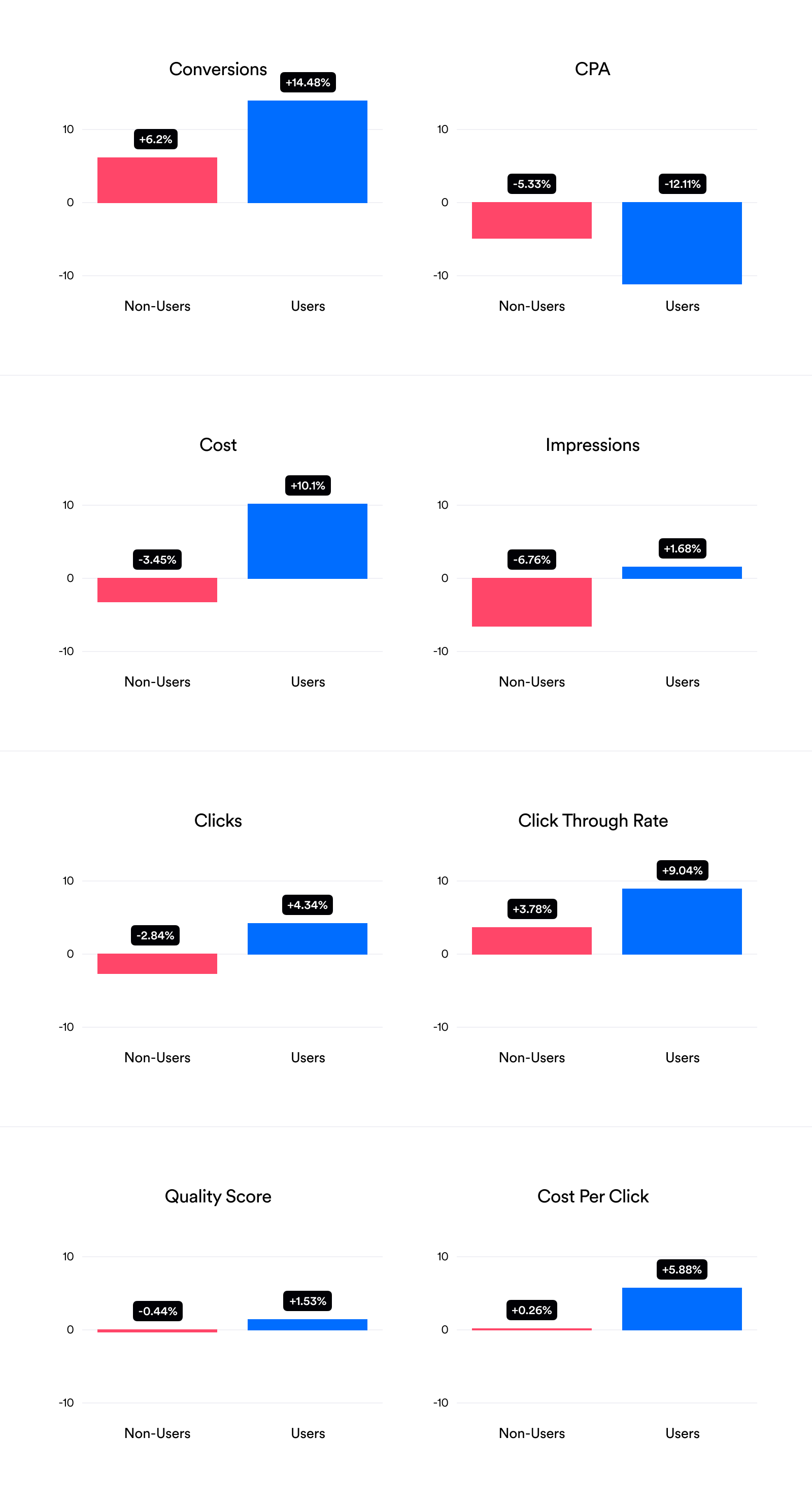
Opteo users should be happy to see that the number of conversions across their accounts increased by 14.5%, whereas for non-users conversions only increased by 6.2%. Opteo users are also showing a significantly reduced CPA, -12.1% vs - 5.3%, implying that the tool is both increasing conversions and boosting efficiency.
Interestingly, both groups saw an increase in conversions despite non-users actually having fewer clicks. The conversion increase for Opteo users comes with a corresponding cost increase of 10.1%. On the other hand, cost decreased by -3.5% for non-users. At first glance this cost increase is pretty worrying, however given that Opteo increases conversions and reduces CPA, it makes sense that these accounts spend more overall — more conversions for a lower CPA means more profit. So, in short, Opteo users are likely seeing more conversions because of an increase in quality impressions, quality clicks, and spend.
Similarly, Opteo users saw an increase in Cost Per Click alongside a decrease in CPA. While a rise in Cost Per Click by itself is not desirable, it may be worth spending more per click to decrease your cost per conversion. Quality Score also increased more for Opteo users, but it's a pretty small change. Click Through Rate also looks higher for Opteo users, but our analysis suggested the increase isn't statistically significant (more on this in the Appendix).
Discussion
We're excited to see validation that Opteo can bring substantial positive changes to Google Ads accounts — particularly the increase in the number of conversions and reduction in CPA. We think that these are the most important factors for the majority of our customers, and show that Opteo can help with account growth as well as efficiency.
It's interesting to see that user Quality Scores increase more than the average non-user account, but the effect is small. This could tie in with Opteo not significantly increasing CTR compared to the control group, which strongly correlates with Quality Score (Google Ads managers will be aware of this relationship, but it's interesting to note we identified a Pearsons correlation of 0.44 between CTR and Quality Score).
Quality Score and CTR could be an area for us to improve in the future, potentially by expanding our existing recommendations and creating new ones that improve these metrics, or by helping users improve their landing page experiences. One clear takeaway, though, is that users need to log in and push improvements to see positive effects. Encouraging new customers to log in more frequently should help maximise the results they get from Opteo.
If you have any questions about this post, or if you'd like to know more about our results, don't hesitate to get in touch with George directly at george@opteo.com.
Appendix
Quasi-experiments
As we mentioned above, a quasi-experiment is one where we can't control the allocation of participants between experimental groups. To avoid the issues of a quasi-experiment, the gold standard of research is a Randomised Controlled Trial (RCT). Let's continue the smoking example used previously: to make our experiment an RCT, we would start with 1,000 people, keep 500 as a Control who must not smoke, and require the other 500 to smoke two packs a day.
Assuming the allocation between the group was truly Random, it's now harder for the tobacco companies to say that smoking isn't the cause. We randomly allocated participants to each group, so they should have started with roughly the same level of exercise, alcohol consumption, and other lifestyle factors.
The example above makes it clear why we can't do an RCT: it's unethical to ask 500 people to smoke, especially if you think it's likely to give them lung cancer. If we believe Opteo improves Google Ads performance and randomly turn it off for hundreds of customers, we would cause adverse outcomes and lose the trust of our customer base. (Opteo still doesn't advise that you take up smoking: fortunately, some very clever people have found ethical ways to prove smoking does in fact cause cancer.)
Propensity matching
Our quasi-experimental setup results in baseline differences: in the smoking example, the baseline differences are things like alcohol consumption, lack of exercise, or other lifestyle factors.
For us, those in the non-user group tended to have much lower averages metrics than those in the user group, especially for impressions, clicks and conversions. This is likely because those who connect an MCC to Opteo are more likely to connect their larger accounts, so many smaller accounts are connected to Opteo, but not managed with it. One solution is to select non-users who are the most similar to those in the user group. To do this, we reviewed the stats from 90 days before signing up to Opteo and used an algorithm to select non-users with similar stats to the users. Then, the non-user group is matched for their propensity to be like user group. See Ho, Imai, King & Stuart (2017) for more on this.
Controlling for baseline difference strengthens causal inference: returning to the smoking metaphor, the tobacco companies can no longer say alcohol was the true cause of cancer because we controlled for that factor (but they can still say it's something we didn't measure — everyone's a critic).
We implemented propensity matching with the excellent R MatchIt package by the authors of the above paper. It doesn't actually affect our final results a great deal, however it does make the descriptive statistics far easier to visualise and interpret.
Why report medians?
In our data, the mean average is not representative of each metric. For instance, say we have 10 accounts with 100 conversions, and 1 account with 1 million conversions. The mean average of these is over 100,000. The median average is 100. As the mean average is 1000 times bigger than 90% of our data points, the median average of 100 is far more representative of our data.
The example above gives you a good idea of what our data looked like: the mean conversions before joining Opteo across both groups is 3,219 conversions, which is larger than 91.6% of our data points. In contrast, the median is 158.5 conversions, which is much more representative for the majority of our user base.
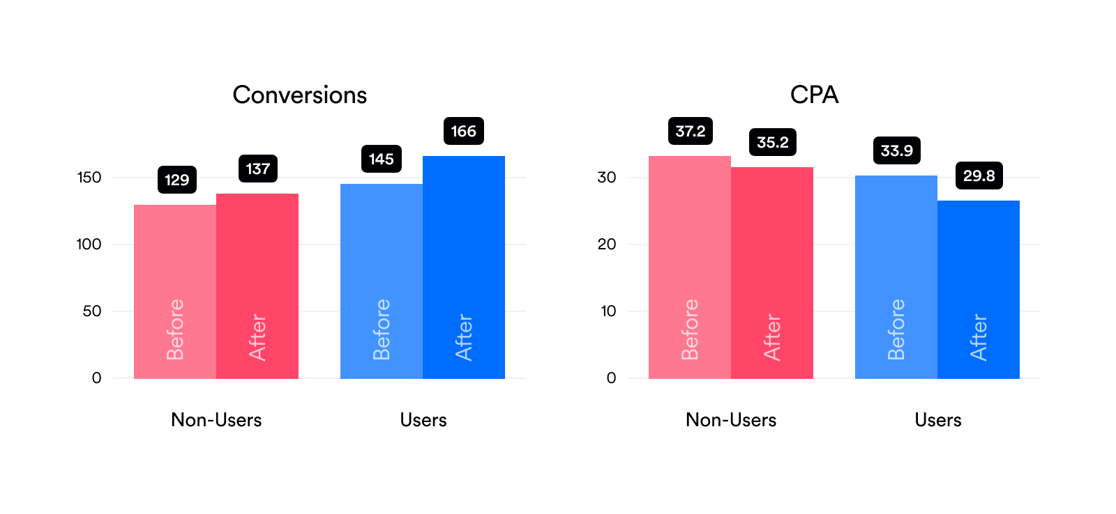
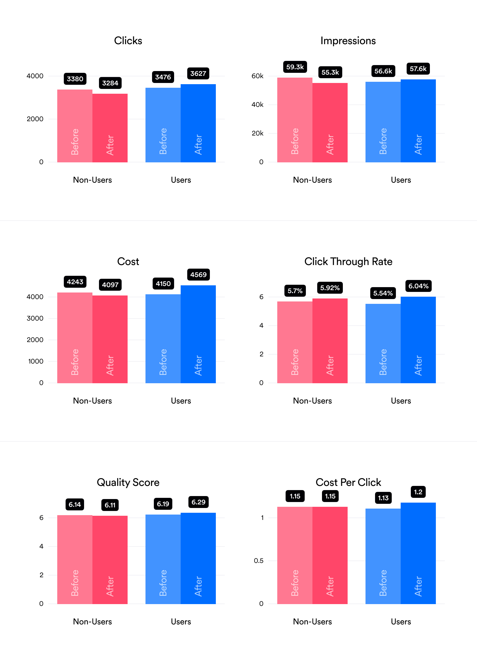
Averages (90 Days Before/After Joining Opteo)
While the percentage change graphs reported above are much easier to understand, it's always good to report the data in the most raw form possible. This lets you make sure we aren't doing any weird comparisons to amplify our results. It also lets you check that the baselines aren't too far off. For instance, here you can see that for most metrics there are some differences between the "Before" groups for users/non-users, even thought we tried to match them. This is pretty hard to avoid avoid with real world data.
How can you be sure that the results of this experiment are statistically significant?
The short answer is an ANCOVA (ANalysis of COVAriance) on the ranked data, run separately for each set. To find out if there's a difference between two sets of data, statisticians have a vast toolbox of tests. Typically, these tests report a p-value, a number between 0-1, which we can think of as the probability that the difference we see in the data is just a fluke.
Typically if this is below 0.05 – or the same as 1 in 20 – we accept our results are likely to be statistically significant. In other words, a p-value of 0.05 means that there's a 1 in 20 chance the differences observed in our data are due to random chance, so reasonably unlikely. (Of course, this assumes you didn't just run 20 experiments and pick the best one. That would be called p-hacking.)
However, most of these tests have a variety of assumptions, one of which is that the data is "normally distributed": meaning most of the data is close to the mean, and then it falls off like a bell curve as shown in the plot on the left:
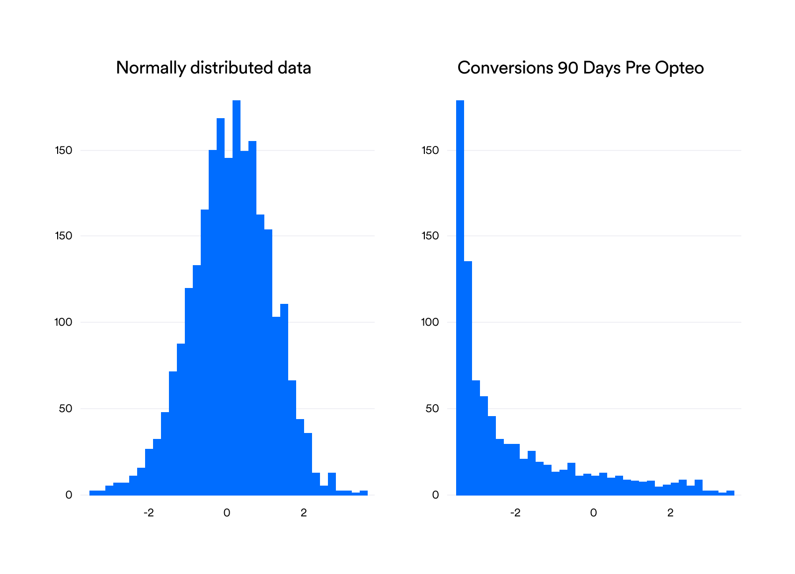
None of the metrics of interest we collected here were normally distributed — each one violated a test for normality. Generally, they were heavily skewed to the right. For instance, the distribution for conversions shows that accounts most commonly have between 10 and 30 conversions. You can't have less than 0, because negative conversions don't exist, and then the data tails off with fewer and fewer observations. Compared to our normally-distributed data, it looks more like half a bell curve, as seen in the plot on the right.
One way to deal with this problem is to use non-parametric tests. A parametric test is one that runs on the parameters themselves — in this example, conversions. The non-parametric version runs on something else: in this case, we take the rankings of the conversion data and run the test on that instead of the data itself. For instance, if we had 4 accounts with [500, 15, 10, 20] conversions, their ranks would be [4, 2, 1, 3].
So, now for the ANCOVA part. This is a kind of analysis that tries to explain the variance in a set of data, or how "spread out" the points are. Simplified, it takes the means of the user and non-user groups and tries to better explain the data by treating them separately, instead of lumping them together.
At this stage, we plug in factors that we're not necessarily interested in, but that might explain some variance in our data — like the alcohol consumption or lack of exercise in our smoking example. We try to let these factors explain as much variance as possible. For instance, if we want to see if there's a difference in the number of conversions between users and non-users after joining Opteo, we plug in the number of conversions acquired before joining and try to explain as much variance as possible using this data. Only after trying to explain this variance, can our model be allowed to start attributing differences in the number of conversions to Opteo.
If you'd like to read more on this subject, this paper has some interesting discussion and simulations of using a ranked ANCOVA.
Detailed Results Table
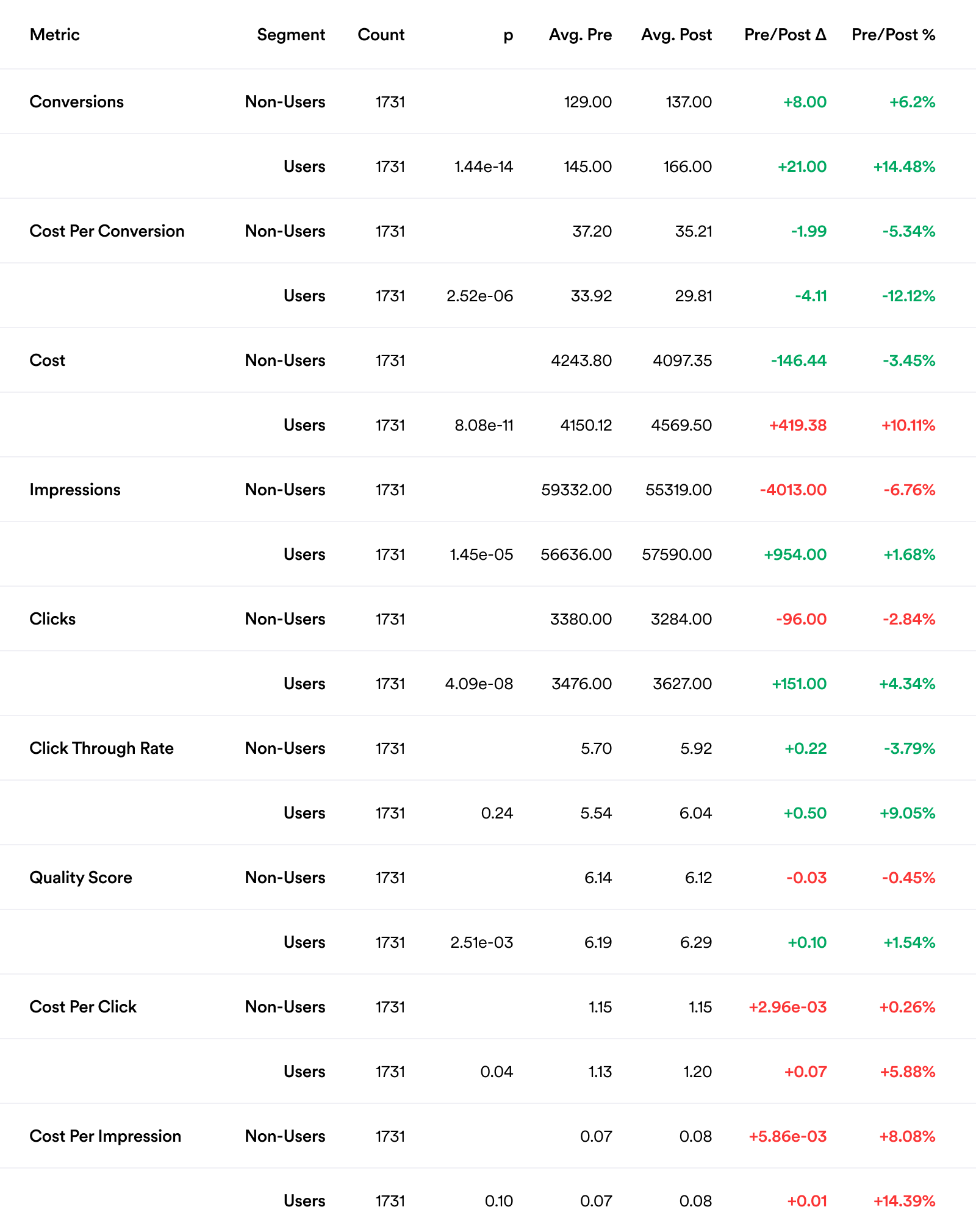
Metric the metric of interest.
Segment whether the account is considered a user or non-user.
Count how many accounts are in this section of the data (see Designing the experiment above for more information).
p for each metric, to see if there was a statistically significant difference (<0.05).
Avg. Pre the median of the specified metric, for the 90 days before joining Opteo (pre Opteo).
Avg. Post the median of the specified metric, for the 90 days after joining Opteo (post Opteo).
Pre/Post Δ the difference between Avg. Pre and Avg. Post.
Pre/Post % the percentage change from Avg. Pre to Avg. Post.
Bonus graphs
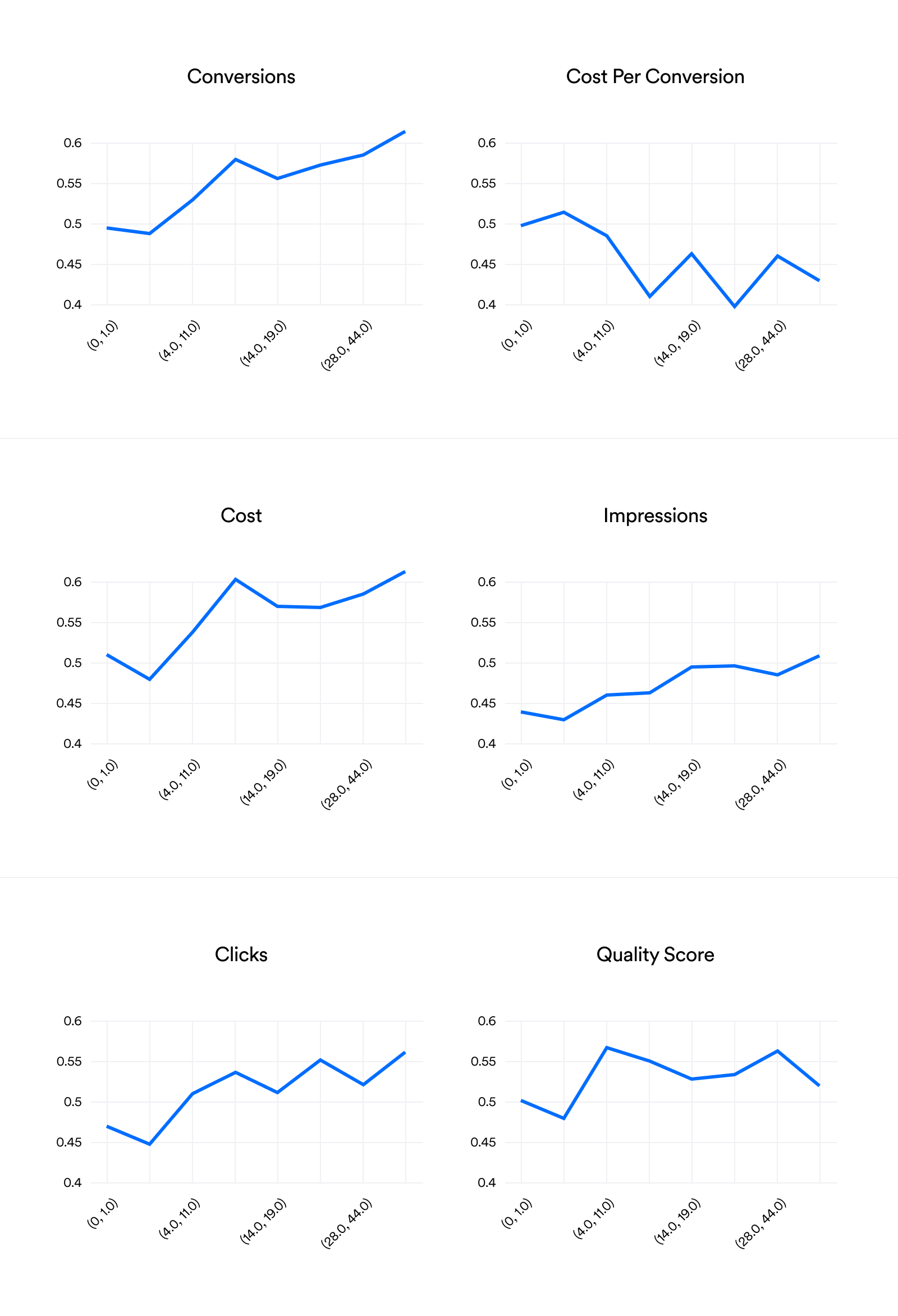
The graphs below show the percentage of users experiencing a positive increase in each metric, grouped by how many times they logged in to Opteo. The x-axis is an attempt to divide the data up into 10 equally-sized groups (deciles), but it's tricky to be precise here, so they aren't exact. We can see that for conversions, the more sessions you have in Opteo, the more likely you are to see an increase in conversions. Similarly, the more times you log in, the more likely it is you'll see a decrease in CPA. Overall, every graph shows that the more you log in, the better your results.